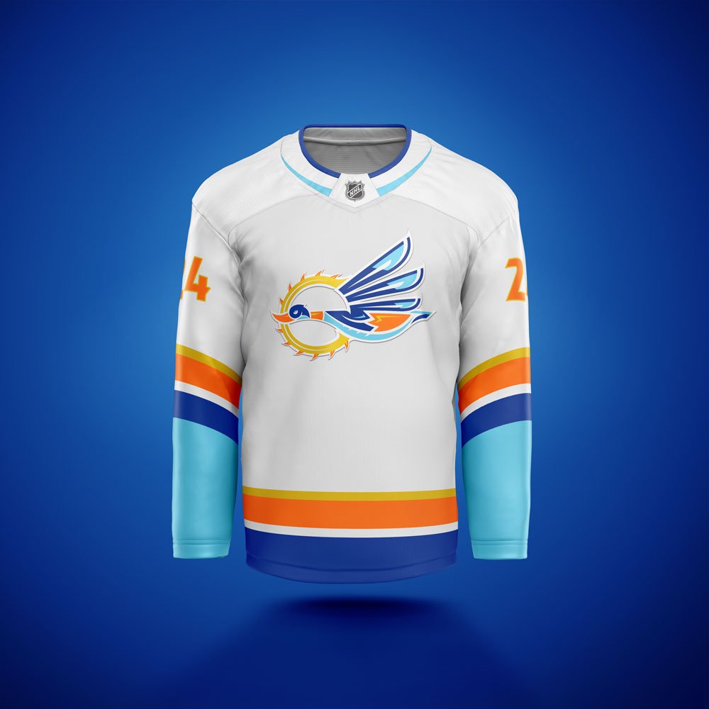
ANAHEIM DUCKS (NHL) REBRAND
Rebrand concept of the Anaheim Ducks of the NHL. Came up with a logo of a flying duck backed by a warm California sun. Went for a really bold, clean, classic logo style with a mix of sharp corners and gliding, tapered curves. The sun doubles as a “C”, for California. The color scheme comes from the flag of the city of Anaheim.